


What first comes out of the Prairie Idea Exchange process looks a little chaotic: A messy pile of sticky notes record the essence of the ideas that come out of the small-group conversations.
But from that chaos, some patterns eventually start to emerge.
Participants mark those ideas that seemed particularly important or resonant to them. Then the sticky notes are grouped with similar ideas. Once they are in clusters, we can step back and see which ideas come through loud and clear—through repetition, or by votes of importance—and which ideas are more “noise” than “signal,” to use the engineering terms.
This time, we refined the results even further, looking at what ideas are connected, and what affects what. This basic systems map is the result. It’s a big-picture view of what participants saw happening and, to some extent, what caused what’s happening.
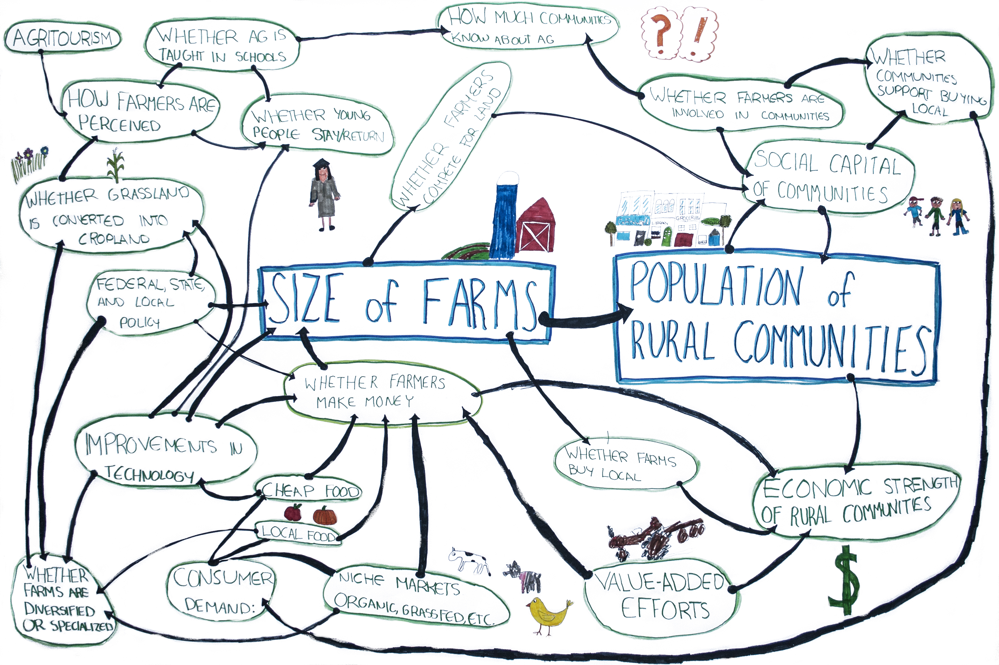
Here’s how to read the graphic:
- Travel along arrows starting at a dot, and going toward an arrowhead. The thing where the arrow starts (dot) affects the thing where the arrow ends (arrowhead).
- The effect can be positive, negative, or neutral. Neither end of the arrow is necessarily a solution, or a problem; it’s just something that participants saw happening.
- These ideas, and the arrows connecting them, are one possible view of what’s happening. The map may not be complete (in fact, it certainly isn’t), and other ideas from other viewpoints could also be valid, even if they contradict what’s here.
- By seeing and thinking about the connections between the ideas on the map, we can start to understand how making a change in one area could affect others.
